So why do tube maps work as clickbait?
Harry Beck has a lot to answer for.
A personal anecdote, as a way into asking a question I’ve been pondering for some years now.
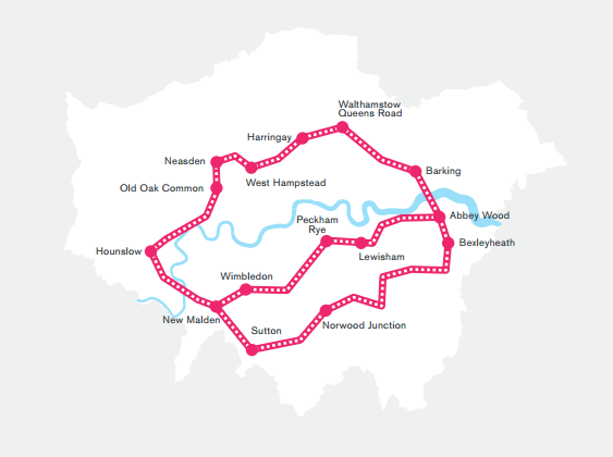
In late July 2014, after the immense stress of launching CityMetric and discovering, the hard way, why “beta testing” is generally a thing, I decided to spend an afternoon doing something silly and fun that I could, just about, still justify as journalism. I read Boris Johnson’s London Infrastructure 2050 plan, and found the dreadful map someone had made of the bullshit “R25” orbital rail plan and identified which lines it showed; then used this information to make a sort of in-carriage line diagram of it to show all the stations, including those which I thought TfL might, in its generosity, add. Here it is now, via the magic of the Wayback Machine.
And… people clicked. A lot of people. After going mildly viral on Twitter, it crossed the blood-brain barrier to Facebook where it went epidemic; I’m not sure if that particular story got picked up and highlighted on Google News, but other, similar ones soon would. Tube maps, it turned out – even imaginary ones, of things that weren’t technically the tube – were traffic gold.
So, I deliberately began to search them out – variations, improvements, prospective future ones – and to write about them, too. After a while, readers began proactively sending me their own efforts, for London at first but then for other places, too, sometimes cities that didn’t even have metros, fantasy tube maps of tiny towns. At some times I’d be, pathetically, a bit excited when I knew I was about to publish a good one: a lot of publishing in the internet age involves cross-subsidising important things using clickbait-y ones, and a decent tube map meant the traffic that week was sorted. At others I’d feel jaded about the cynicism of the whole exercise, and couldn’t be bothered to disguise the fact, beginning my write ups with, “Here’s another tube map for you pathetic little nerds. This is what you want, isn’t it? Click, monkeys! Click!” (I paraphrase, but by a lot less than you think.)
Occasionally, unsurprisingly, I would find myself mocked for all this, as if it reflected my own personal obsession and nothing more. But while I like a tube map as much as the next man – like all normal adolescents I had once made my own, just at the point when I could first get served in pubs (it’s sadly long gone from the internet) – the reason I kept publishing them was the traffic. And so I began to ponder a question: why exactly were tube maps guaranteed sources of traffic? Why were they to CityMetric what sideboobs and wardrobe malfunctions are to Mail Online, and animal pictures are to, well, the entire rest of the internet?
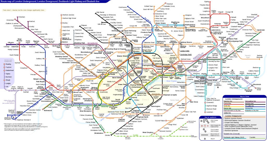
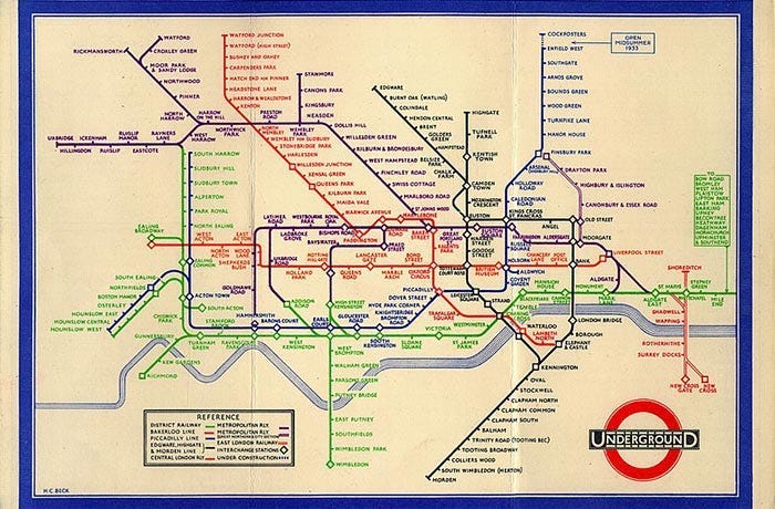
The simplest theory is that it’s a design classic. The story of Harry Beck – the technical draughtsman who first realised that all passengers really needed to know was the order of stations and locations of interchanges; that the network could thus be illustrated like a circuit diagram, rather than a map – is so familiar that it’s easy to lose sight of how revolutionary his original insight was. Before Beck, metro and railway maps were always geographical; after him, they hardly ever were. Perhaps there’s just something in the simplicity, cleanness and clarity of the network’s design that grabs people.
Then again, that simplicity and cleanness has rather been lost in recent years, thanks to the profusion of lines, not all of which deserve to be on there, plus TfL’s insistence on piling in extra information, whether important (is a station wheelchair accessible?) or not (does the ever multiplying complexity of the zonal fare map really need to be quite so prominent?). So perhaps the enthusiasm for new and better tube map designs isn’t so much about how good the map is, but about something closer to the opposite.
Both those things are no doubt in there. But having been thinking about this for quite literally years, I think there might be other factors behind the clickbait nature of tube map content, that are not so much about the maps as our relationship to them.
The thing about a map, you see, is that you can place yourself within it. How often have you been in a new city and booted up Google Maps so you can orientate yourself? In the same way, if you’re a Londoner, a new view of the tube map is an invite to locate yourself – your home, your work, the places you socialise – and see how they relate to the city around them.

More than that, a good metro map finds new ways of carving up a city, filling it with colour and evocative names. Some people identify themselves with their local stations or regular lines, just as they might with boroughs, postcodes or sides of town; there is a reason why you instinctively identify places on the line that takes you home as somehow “local”, even if you have never lived there. The tube map is a source of identity, a hyper-local version of the same impulse that gave us football fans or nationalism.
Most importantly of all, there are around 9 million people in London, and several million more who commute in or regularly visit. That’s perhaps 15 million mental models of the city, with different ideas of where matters and what places mean. To some, a particular street or district may offer the warmth and welcome of familiar cafes, pubs or friends; to others, it’s as anonymous and alien as a million other streets in a thousand other cities. There is no way of reconciling these millions upon millions of different Londons. No single, universally comprehensible reference point we all share.
Except for the map on which we can all find ourselves, and with which we’ve probably been as familiar for as long as we’ve wondered how this vast and complicated city all connects up.
This is why, I suspect, it feels momentarily exciting to see your home station appear on the tube map for the first time – why the addition of the DLR and Overground and Elizabeth Line have not just made it easier to get around the city, but opened up vast swathes of it to people who would not have previously visited or moved to those locations before. It may even be why, once upon a time, cabbies preferred not to go south of the river: being off the tube meant it was off the map for enough Londoners to make it not worth bothering with, even if you were driving a cab.
It’s not just that the tube map is a way of viewing the city. For many people, it is the city.
So, that’s why I think people click on tube map stories. Even the ones who didn’t waste their teenage years making their own maps in Microsoft Paint.
The Gratuitous Dog Picture & Sales Pitch Bit
The article above is an extract from the archive of the Newsletter of (Not Quite) Everything, a weekly newsletter which goes out every Wednesday at 4pm. Become a paying subscriber, and each week you’ll get a bit on politics, some diverting links, an article on history/geography/language/something, and the map of the week. But that’s not all! You’ll also get a warm glow of satisfaction that you’re helping me to write nerdy and interesting things, often involving tube maps, and not boring corporate ones. And all for just £4 a month or £40£28 a year! While stocks last!
But: we’re all broke right now. If you can’t currently justify paying for some nerd’s substack (unemployed, underemployed, impoverished student, and so forth), just hit reply and ask nicely and I’ll give you a complimentary subscription, no questions asked.
Alternatively, why not do one of the following:
a) Subscribe to Paper Cuts, the daily paper and news review podcast on which I can frequently be heard sounding off;
b) read this week’s New Statesman column, on the real reason men can’t stop thinking about the Roman Empire; or
c) Pre-order my new book, out next April? I’m reading the proofs now and I think it might be good.


