The ‘Out Of Office’ Is On
But before my holiday, I asked TfL: so are you gonna fix the tube map or what? Also this week: some notes on Cornish place names.
By the time you read this I will be far away – unless, of course, you’re on the Iberian peninsula, in which case I will be unexpectedly and unnervingly close. My week in Lisbon is my first foreign holiday since before the pandemic – yes, I know – and although I’ll still be hanging around social media, because I’m going on my own and if I don’t I’ll get lonely, I am absolutely determined not to do even a tiny bit of work.
So, this week’s newsletter is slightly shorter than normal, and also upside down: I’m starting with the links, which normally go at the bottom, with some actual writing (some notes on Cornish place names; the rest of my interview with the man in charge of the tube map) to follow. Next week’s edition will be a guest post, from friend of the newsletter and long-standing backup me Ed Jefferson. I’ll be back with all the usual goodies in two weeks.
Links, etc.
1. “A politics whose most fundamental idea is Make Progress Stop Happening would inevitably find itself fetishizing the torment of having to live in a world in which other people, who are not even you, are somehow supposed to matter just as much.” A fantastic bit of writing about the US, by The Defector’s David Roth.
2. Sticking with that subject, whoever is writing the headlines on press releases for the Harris/Walz campaign deserves a pay rise. Consider this: “Donald Trump To Ramble Incoherently and Spread Dangerous Lies in Public, but at Different Home”.
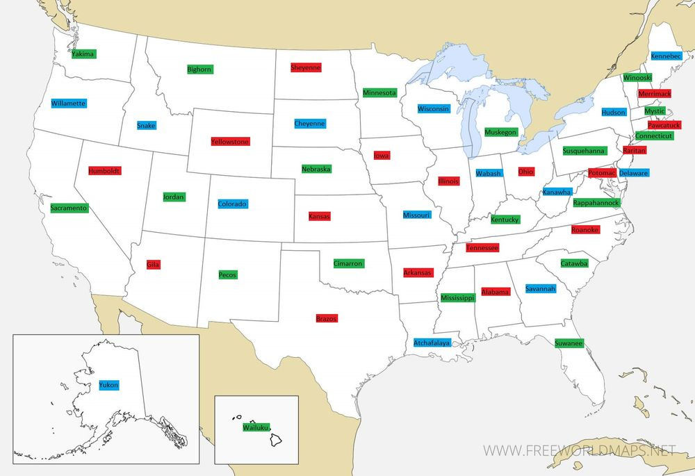
3. Not doing a full write up of a map this week (I did mention being on holiday, right?), but I really enjoyed Nick Brumfield’s effort showing what the US states should have been named, had they all been named for rivers:
By my count there are 16 states, nearly a third of the total, which are unchanged. There are none which seem to have swapped with a neighbour, which feels both surprising and slightly disappointing, although renaming Alaska “Yukon” would presumably be of some mild irritation to those in the neighbouring territory of Canada. I think my favourite new state names are Snake (Idaho), Brazos (Texas) and Mystic (Massachusetts).
Anyway, Nick explains his logic in the thread below.
4. I’d always assumed I’d be there until the bitter end. Now, I’m not so sure. This week’s New Statesman column is a sort of eulogy for Twitter.
5. “The campaign responded with a blog post headed: ‘Why RBWM can’t afford not to back out of golf course deal’, so good luck with that.” This week’s Nimby Watch concerns the people trying to block housing development on a golf course next to a Crossrail station, who haven’t realised they’re the baddies.
6. “You don’t have to be shoehorned into something else because you didn’t reach an arbitrary score to do something you are passionate about. Time is your friend.” My terrifyingly impressive mentee Matt Taylor, on how he got two GCSEs and still ended up studying at Oxford.
7. I was on yesterday’s episode of Oh God, What Now? talking to Jacob Jarvis, Zoe Grunewald and Hugo Rifkind about Labour’s relationship with the unions, and the irritating refusal of defeated Tories to shut up and go away.
8. I was also on Paper Cuts on both Thursday (Liz Truss and ageing, with Jason and Alex) and Monday (Taylor vs Trump, and from “brat” to “demure”, with Marcus and Alex again).
I do think that risking war with Taylor Swift by fabricating a “Swifties for Trump” movement out of almost, but not quite, whole cloth (there does appear to be one) could be the former president’s stupidest move yet. For some reason I keep thinking about the fate of King Pentheus in The Bacchae. But that’s by the by.
9. “You can’t be in on the joke when you are the joke.” This is a week old – it came out about 20 minutes after last Wednesday’s newsletter – but last week I made my debut in the comment pages of the i Paper with this bit on Liz Truss.
10. My furry and excitable life partner Henry Scampi is spending the week with my mother, who will of course be delighted by the near hourly requests for updates on his activities. I may spend some time re-examining Edith Charles’ thread of “comical/worrying dog crossbreeds” for comfort. (Twitter may be dying, but Blue Sky is really starting to deliver the goods, huh?)
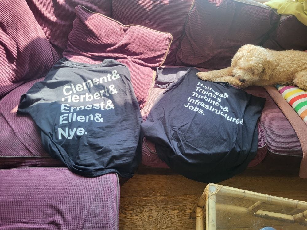
11. And finally, let us all enjoy the tshirts I had made while sick and off my head on codeine the other week:
So is TfL going to fix the Tube Map or what?
A few weeks ago, I spoke to Transport for London’s “head of crayons” – or, if you want to be formal about it, design – Jon Hunter, to ask how a fully operational transport network went about rebranding an entire Overground rail network as six different lines. The answer, it turned out, was surprisingly quietly.
That was the main topic of our conversation – but a measurable share of my time has been dedicated to bitching about the declining quality of the Tube Map for about as long as I can remember. Since Hunter is the man in ultimate charge of the tube map, it thus felt like it would be remiss not to ask him if there were any plans to rethink things to address any of the many things that annoy me.
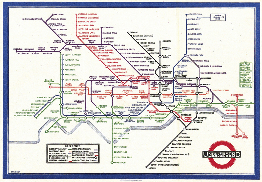
Well, big news: TfL has, it turned out, looked into this. “We did an exercise a couple of years ago,” Hunter told me. “There’s been a lot of criticism about how Harry Beck’s version” – the work of the draughtsman who originated the modern Tube Map, essentially inventing the modern science of metro maps in the process – “was better”.
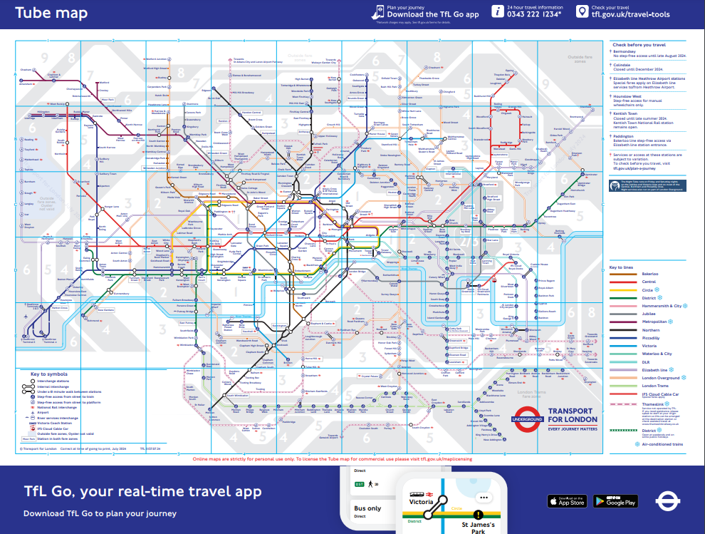
But, Hunter added: “When you look at the number of lines and stations, we have a vastly more complex network now, and we do make it as simple as we possibly can.” It was relatively easy, in other words, for Harry Beck to simplify the network as it existed in the 1930s. But throw in two extra tube lines, a bunch of suburban extensions necessitating more space to the north and east, six different Overground lines, two light rail systems, the cable car, the Elizabeth line, Thameslink… The design of the modern Tube Map is messier, Hunter argues, because the network is more complicated.
Far be it from me to question the judgement of a man who knows far more about these things than I do, but: I am not entirely convinced by this. It isn’t just Harry Beck’s map that feels cleaner than the modern map, but numerous amateur versions, by the likes of Jug Cerovic, Wikipedia-user “Sameboat”, or Maxwell Roberts, the psychology lecturer behind Tube Map Central and the man whose circular tube map I wrote about last week. The latter, as it happens, agrees that the modern Tube Map has lost its way. “The current state of the official London Underground map is lamentable for all sorts of reasons,” he argued in a recent post. “It fails by any criterion of effectiveness you can imagine and has been in a neglected state of decline for years.” So has there really been no thought of starting with a blank page and trying again from scratch?
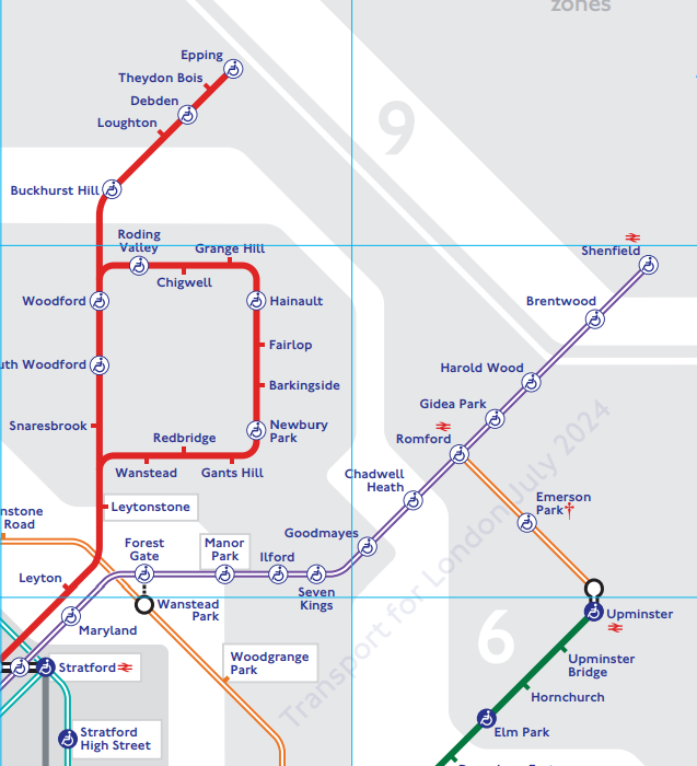
“We do sometimes debate that,” Hunter admits. “But we need to be really careful not to damage one of our crown jewels.” The extant tube map relies on various graphical shortcuts – Hunter highlights the P-shape of the Hainult loop, or the way the Central line sweeps down to central London and up again – that users have come to rely on when orienting themselves. “There’s a risk that any meaningful change would render it very alien to most customers.”
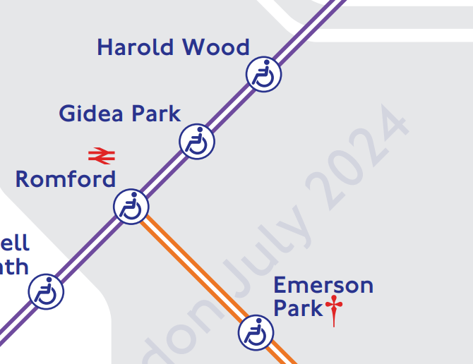
The result is that, while TfL has mocked-up alternative designs, “the end result doesn’t make it less complicated: you still end up with a complex network, that’s just drawn in a different way. And then you’ve created a new barrier, because you’ve undone the mental tricks customers have built up over a decade, and they need to learn a new graphical approach.” More than that, one passenger’s unnecessary clutter – the icons showing different levels of wheelchair access, the sometimes overcomplicated layout of intersections – is another’s vital accessibility data. “Generally what I find is [alternative maps], which make information cleaner and easier to understand, do so at the cost of removing accessibility information or fare information.” All of which means that, when it comes to creating an entirely new map, “the juice is not worth the squeeze”.
That said, Hunter does say the map is constantly under review. His team are looking at ways of cleaning up some of the more complicated interchange stations, like Moorgate/Liverpool Street or Paddington. And he responds surprisingly well to my rant about how the use of various shades of grey to show the fare zones is ruining the map for everyone. “That’s something we are looking at over the next period of time: we’re doing in-depth research with customers, asking whether people still use the fare map to plan their journey.”
Even more pleasingly, when I complain that the current map shows the two Bethnal Green stations the wrong way around – the Overground, which lies to the south, is currently shown above the Underground, a fact that particularly annoys me because they’re my local stations – Hunter replies, “I’ll make a note of that and look into it.” It could be a necessary trade off to avoid over-complicating the design, I admit, with my characteristic generosity; sure, Hunter replies, but it could also be that simply that nobody realised. Watch this space.
There is one other thing I want to ask Hunter about before I let him go: some of the decisions around showing the network’s newest railway. Why, I ask, is it always “Elizabeth line” on signage – and never just “Elizabeth”, in the way you will see “Piccadilly” or “Bakerloo”?
“Two reasons,” he says. One is that “it’s not just a line, but a mode in itself” – something comparable not merely to the Bakerloo, but to the entire Tube. I’m not convinced by this either, but this does seem to be the line from all parties, and I suppose if you spent £18bn on a railway line you’d probably want to treat it like it was an entire new network, too.
The other reason is “to give it the full respect that the name should have. It’s named after the previous monarch – calling it ‘line’ provides the context that this is a railway”. Before I can suggest this sounds just a bit forelock tug-y, Hunter makes the annoyingly reasonable point that Britain’s biggest railways are generally referred to as, say, “the East Coast Main Line”, not merely “the East Coast”. It still feels a little unnecessary: but over time, I imagine, as “Elizabeth” comes to feel no stranger as a line- or place name than “Victoria”, the “line” may be quietly dropped.
There’s just one more thing, I ask, imagining myself to have an ace up my sleeve like Columbo: given Hunter’s focus on brand consistency, why are the parallel lines of the Elizabeth Line still the dark blue of its predecessor, TfL Rail, on the Tube Map? Why are they not, as all the signage and branding suggests they should be, purple?
At which, he says something that genuinely surprises me: that it is purple after all. It’s only the density of other colours around it that means it can appear, to some of us1, blue. He compares the phenomenon to the viral photograph of the blue and black/white and gold dress that went viral back in 2015. “It’s the limitations of print, and how the brain processes a small amount of one colour compared to other colours. It means that sometimes it looks more blue than it does purple.”
This feels like obvious nonsense – I know what colour I’m looking at. But when I zoom in on the map and look at a stretch of the Elizabeth line without others to distract me, it turns out he’s entirely correct. It really has been purple this entire time.
It’s at least possible that the head of design at TfL does know more about the Tube Map than I do after all.
Some rambling notes on Cornish place names
A few months back, you may recall, I spent a few days in Cornwall, with my friend and sometime co-author Tom Phillips. We were talking about Cornish identity, because I am just as much fun in person as you imagine me to be; and Tom told me that, despite having spent much of his life in Cornwall, he’d always slightly suspected that Cornish nationhood of being an ever so slightly made up thing.2
Until, that is, he had a play with Robin Wilson’s place names tool which I wrote about back in April. Three prefixes that come up a lot in Cornish names, you may recall, are Tre- meaning a settlement or homestead; Pol-, a pond, lake or well; and Pen-, a hill or headland. “By Tre, Pol and Pen,” Richard Carew wrote in his 1602 Survey of Cornwall, “shall ye know all Cornishmen”.
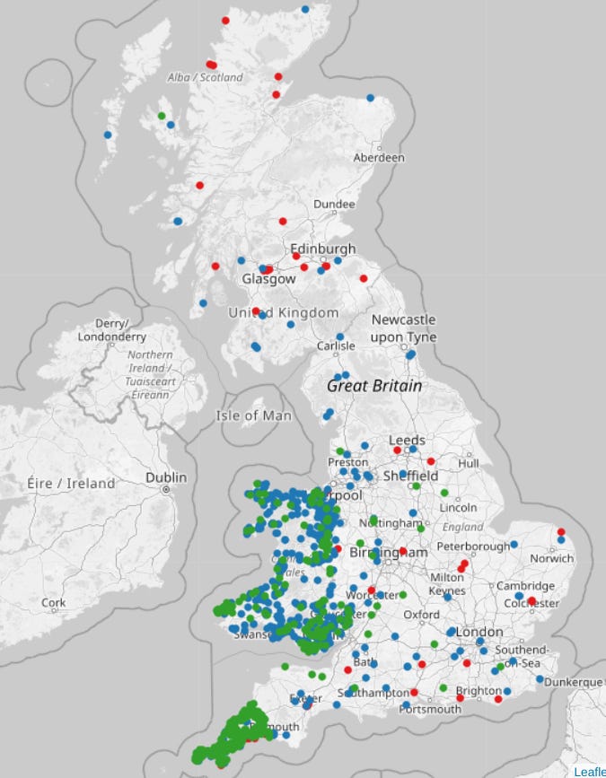
Here, courtesy of Wilson, is a map of British place names beginning with those syllables. (“Tre” is in green, “Pol” in red, “Pen” in blue.) See if you can spot the River Tamar, which makes the Cornwall/Devon border:
It’s striking, in fact, that the only other part of the UK that comes close to that intensity of those place names is Wales. Both Welsh and Cornish, of course, are descended from the Brythonic language spoken on this island before the Anglo-Saxons started arriving, probably, in the 5th and 6th centuries.
So, as it happens, is Breton, the language of the westernmost province of France, whose name is sometimes said to mean, essentially, “Little Britain”. The details are all a bit hazy – the history of northwestern Europe in the 5th and 6th centuries generally is – but the Anglo-Saxon arrivals in Britannia may have led large numbers of the original inhabitants to flee across the channel to what was then known as Armorica. This would fit with the fact that petty kingdoms named Domnonée/Dumnonia and Cornouaille/Cornwall existed for a time on both sides of the Channel.
At any rate, Tre-, Pol- and Pen- can be found in Brittany too, along with plenty of other place name elements found widely in both Cornwall and Wales: here’s a chart from a Breton (I think) blogger. Although why it is that the British “Dumnonia” ended up anglicised, when neighbouring Cornwall did not, is anybody’s guess.
That’s your lot for this week – the Newsletter of (Not Quite) Everything will be back with a guest post from Ed Jefferson next week. I’ll be back in two weeks. No raucous teenage parties while I’m gone, kids.
It’s not just me, right?
I’m paraphrasing and possibly exaggerating Tom’s position here. Cornish nationalist readers, please murder me, not him.



I strongly suspect that the 'Tre-' just SW of Nottingham is 'Trent Lock', which is probably only distantly related to a p-celtic language, if at all.
I’ve seen someone in Islington twice in the last few days wearing a Clement & c. t-shirt, and both times wanted to stop and say - nice t-shirt. Was it you? If so: nice t-shirt!