Some notes on the non-existence of purple
The colour light forgot.

Paying subscribers got to read this in August.
Did you know that purple doesn’t exist? The internet certainly knows that. Google the phrase “purple doesn’t exist” and you will find articles explaining the fact published by everyone from Mail Online to Unilad to the Economic Times of India. And little wonder: the internet loves to tell you that everything you know is wrong, and what better “well, actually” could there be than “that colour you’ve been able to identify since you were five years old isn’t really there”?
So: the colour purple doesn’t exist. Alice Walker lied to you.
Except – it does. It obviously does. Everyone from Cadbury Chocolate to the UK Independence Party to the artist at one time known as Prince has made use of purple in their branding. Emperors stretching from Rome to Japan have clad themselves in purple, because a particular rare dye made from the secretions of sea snails – Tyrian purple – made it the most exclusive of all colours. There’s a fairly reasonable chance that, if you look around, you’ll spot something purple right now. (I did – it’s a massive pillow.) Purple absolutely definitely exists. You apologise to Alice Walker, right now!
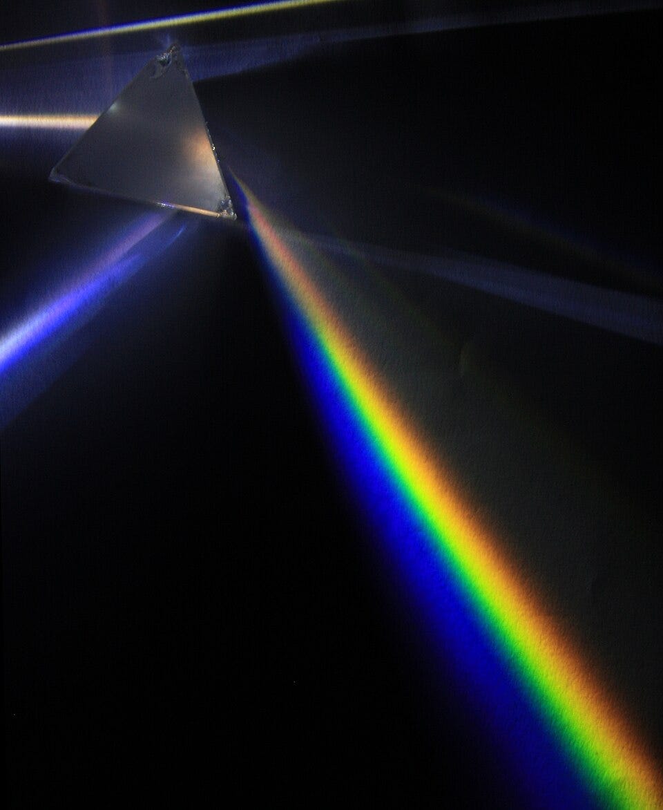
To explain how purple can be legitimately said not to exist, even though it very definitely does, we need to remind ourselves of some primary school science. Colour is a property of the wavelengths of light. The visible spectrum – which ranges from around 350 nanometers at the violet end to around 750 nanometers at the red end, and which represents a mere 0.0035% of the electromagnetic spectrum – can be represented by a spectrum, made famous by both the cover of Pink Floyd’s The Dark Side of the Moon and rainbows. Do stop me if I’m going too fast for you here.
Where is purple in the visible spectrum of light? Well, it isn’t. That spectrum contains violet of course, which is a bit like purple – but the bolder, redder, more magenta-y and less blue-y purple isn’t there at all. Purple – to continue our “things we learned at primary school” theme – is what you get if you mix red paint with blue. The problem, though, is there is no colour directly between red and blue because they’re at opposite ends of the spectrum. If you just split the difference and look in between them you’ll find a greenish yellow (or a yellowy green), which is many things but absolutely not purple. There is no wavelength of light that accords with what we see as purple.
So what is it we’re seeing when we see purple? Well, it’s – and this will blow your mind – a combination of red and blue.
Most human eyes identify colour using three different types of receptors. (Dichromats only have two, and are thus colour blind; tetrachromats have four and are really good at colour. But most people have three.) The majority of these, around 60%, are long wavelength (L) cones which pick up reddish light; around 30% are medium wavelength (M) cones which pick up greenish light; the remainder are shortwave (S) cones, which pick up blue.

Obviously most of us can see more than three colours. The brain decides what colour something is based on the extent to which it activates different types of cone. Something that activates red and green cones but not blue will read as yellow; something that activates blue and green as cyan; something that activates blue to the same extent but not green will be violet; and so on.1
Purple is just what happens when something has red and blue wavelengths but not green ones. That isn’t an effect that you can achieve from a single wavelength – but it is clearly something that can be achieved through combinations of different wavelengths, and by way of evidence I could point to the packaging of some Cadbury’s Dairy Milk, or my pillowcase. So yes, purple does exist: it just doesn’t exist as a single wavelength of light on the colour spectrum. It’s what is known as a “non-spectral colour”.
If you stop to think about it, in fact, you swiftly realise that there are loads of non-spectral colours. There are the greyscale colours – black, white, and the greys in between – which scientists will also sometimes argue aren’t colours in the same way that red and blue are, but which in the everyday use of the term clearly are. There are the colours which involve mixing those with the spectral colours, like pink (red plus white) or brown (orange plus black). There are names for these: colours mixed with white are tints, those with black are shades and those with grey are tones. Even though we use all those words interchangeably to mean, essentially, “colours”.

There are the metallic colours, where a key property is how they reflect light differently depending on the relative positions of light source, object and eye. None of these are found on the visible spectrum. In other words, despite those primary school science lessons, colour is not something that can be represented simply as a one dimensional line. Colours have other characteristics that make it better to demonstrate on a two-dimensional colour wheel, or even a three dimensional colour block of the sort it’s hard to show as a flat image.
These can be represented in a bunch of different ways that are quite hard to get your head around. One commonly used system defines hue (the point on the colour wheel), value (how light or dark it is, on a scale from black to white) and saturation (the intensity of that colour, from vivid to dull). I feel like we’re approaching the limit of non-specialist knowledge here, and I’m not sure I have either understanding or vocabulary to explain exactly how those latter two differ – less saturated versions of colour seem to be greyer, but since grey is just the halfway point between black and white I’m not sure how to relate this to the bits of science I know – so I’m going to resort to showing rather than telling. Here, courtesy of Google’s colour picker tool, is a bright but unsaturated red...

...and here’s a saturated but much less bright one…

The difficulty representing this in a way comprehensible to the layman (or at least to me) is perhaps best demonstrated by fact there are multiple ways of combining these factors to products entirely different spectra:

Anyway: the key point here is that purple only doesn’t exist if you define colour as “actually existing wavelengths of light”. At that point, sure, it doesn’t exist, for the same reason there’s no stop directly between Walthamstow and Brixton on the Victoria line – because it isn’t a loop, it’s a line. But colour – the way we actually experience colour – isn’t just a line. Colour is a matter of perception, not merely physics.
And the way you can tell that is that purple definitely exists.2
If you enjoyed this, and would like to get a weekly newsletter full of such goodies, but can’t currently afford a subscription, then hit reply and ask nicely and I’ll give you a comp. If you can afford it, though, and want more of it, then:
This is also how TVs work, and on the old ones with relatively large pixels you could check. From a distance they’d show all the colours of the rainbow. But lean right in – as I often did in the ‘80s, for my own amusement, to the noisy outrage of my maternal grandmother, who thought I’d go blind – and you’d see that each pixel was actually red, blue and green lights shown in different quantities, and that this could somehow translate to essentially all other colours. Still blows my mind, that.
“I feel like there is a footnote about octarine somewhere in this section,” writes Jasper, who has once again forgotten my surprising antipathy to the work of Terry Pratchett.