All change on the Overground
So how do you re-name and re-brand an entire operational urban rail network?
A reminder before we begin. On Saturday afternoon, the first ever Paper Cuts live show is happening at the Clapham Grand. Miranda’s hosting, with myself, Marcus Brigstocke, Coco Khan and (OH NO NOT HER) Gráinne Maguire completing the line-up. Come along, it’ll be brilliant.
Anyway, this went to paying subscribers in August:
Last spring, to great fanfare, Transport for London unveiled the new names for the six lines1 of the London Overground rail network. There was excitement, in some quarters2, about the biggest shake up of the capital’s tube map in many a year. There was rage about the (this from the Daily Mail) “patronising and insultingly twee” choice of names. There was also cheering about the exact same thing, and the fact that it had annoyed the people who were annoyed by it. There were even columns, by humble substackers, in national newspapers.
And then – well, it stopped. The hullabaloo died down, but other than some temporary posters at Overground stations, announcing that the new names were on their way, not a lot seemed to happen.
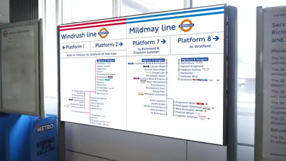
That didn’t seem right: TfL had said that the changes would be complete this autumn. And there must surely be quite a lot of things to change. Maps on platforms; maps in trains; wayfinding signs at stations (6,000 of them, TfL says); digital information, everywhere you might think of to look for it. All of this must be changed, as quickly and seamlessly as possible.
So what, I wondered, is actually happening? What does a change like this actually involve? And blessed as I am with the sort of newsletter in which I can write about pretty much whatever I damn well please, I decided to ask.
First things first; the names were not the most difficult thing. They may have been the most controversial element, and required a long selection process (consultation exercises, engagement with stakeholders, long list, short list and so on). But “whatever names we had been picked would have been quite divisive,” argues Jon Hunter, Transport for London’s head of design – or as he cheerfully describes himself, “head of crayons”. “So long as there’s a story, people will accept them eventually.”
And the names, in fact, came after much of the work on a rather less discussed element of the new line identities: the colours. These will be shown on the map in what are known as ‘tramlines’: two coloured lines, with a third white line of equal width separating them.3 TfL’s intention is that these should become as instinctively associated with the lines they represent as the colours of the tube lines are today – that one day a map showing the Overground in uniform orange should look as strange and jarring as early Tube maps showing the Bakerloo in red and Central in yellow now do.
Picking the new colours, though, was no easy business. All six needed to work on both the Tube map and the more extensive Tube & Rail Map, produced in collaboration with the Rail Delivery Group. They also needed to be colours that wouldn’t clash with branding used by other organisations (other bits of TfL, train operating companies) whose material they might appear near.
Most importantly they had to be striking and easily recognisable when reproduced on vitreous enamel, of the sort used on TfL signage (and also, unexpectedly, fabergé eggs). Though it gets less attention than minor changes to the Tube Map, TfL sees this “materiality” as another key part of its branding, Hunter says, and the use of such enamel has a number of benefits. It’s self cleaning and static inert, so dirt doesn’t build up as it would on, say, aluminium. The colours also remain stable, even when exposed to light for long periods. There is signage still extant on the tube today that’s been up for a century or more; the new generation of overground signage is being designed with similar lifespans in mind.
That durability does, though, come with restrictions: it means, for example, that the colours can’t be too bright. So selecting the new colours was done “with great care and over quite a long period of time”, Hunter says. Around eight possible shades were identified, then shuffled through various combinations to minimise clashes (areas where lines of similar colours meet, for example). The selection was only finalised after the line names had been chosen, so that, where possible, there would be a link between colour and name. So, the Mildmay line, named after a hospital, is a blue not a millions miles from the NHS logo; the Suffragette is a sort of pear green in part because that means the tramlines end up representing two thirds of that movement’s green/purple/white tricolour. The Lioness is yellow because, well, lions are yellow.
Hunter didn’t give reasons for the other three (red for Windrush, maroon for Weaver, grey for Liberty): they were just the best options from the colours left over. But it seems likely Londoners will be associating them with their lines and instinctively navigating by them very soon. “The names and colours normalise through use,” Hunter notes. “I don’t mean decades of use, but months: this stuff embeds very quickly.” There was an outcry from some about the name “Elizabeth line” when it was first announced back in 2016, he notes – but “very few people still call it Crossrail now”.
Less agonising went into the decision to show the lines as hollow tramlines, not solid colour. “We use hollow/filled to provide some kind of semiotic difference between tube and other lines,” Hunter explains.4 The main difference between the two is headway: “The Victoria line runs every 1-2 minutes, while parts of the overground are much less frequent.”
I’m not entirely sold on this – the Elizabeth line and parts of the DLR get high frequency services, while parts of the outer tube network do not, yet it’s the latter which get the imprimatur of solid colour. But, Hunter adds, the human eye’s inability to distinguish more than around a dozen colours at a glance would mean that “if we just went for all solid colours we would have ended up with different graphical language by now anyway”. This is, after all, why Paris uses different thicknesses to show different types of train; New York bundles multiple lines into single colours; and so on.
That covers what the changes are. But how will they be rolled out across the network?
As it turns out, quietly, largely unnoticed, that’s been happening for ages. Backroom efforts to redraw maps and signage schemes have been going on since last summer, many months before the announcement was made. TfL has already published updated maps incorporating the new designs (which got a lot of attention on the internet), and assorted design guides outlining technical details (which by and large haven’t).

The biggest, most public bit of the change, though, will be the replacement of existing signage using uniform Overground orange with new wayfinding signs using the new names and colours. This, says Hunter, has been the “most complicated part of it” but, miraculously, most of it has already happened. At the time we speak, in mid July, he tells me that around 70% of the signage has already been replaced.
So why haven’t regular passengers noticed it on their commutes? Because the new signs are hidden by, effectively, stickers. “You shouldn’t notice that there’s been any physical change to the signage unless you look quite closely and notice, say, a little bit of blue at a Mildmay station,” he explains. “Over a period of a few days all of that temporary vinyl overlay will be removed and the new signage will be revealed.” The reason for this “peel and reveal” approach is that the change involves 113 stations across six lines: “It’s probably the biggest [such change] Europe, if not the world, has ever done in a live environment… Unless we do what we call a big bang change, we risk creating a confusing mess for people.”

While all this is going on, other teams are updating other materials: not just the printed line maps, but electronic systems like the moving line diagrams shown on screens aboard trains; the journey planner app, TfL Go; the physical boards which update passengers about disruptions. “It’s an overused word, but it really is a herculean effort,” says Hunter. “It involves many many teams, many organisations, ourselves, our partners at Arriva [the company which operates the Overground], MTR [same, with the Elizabeth line] and C2C [Barking and Upminster stations]”.
Even then the job won’t be done: there’ll still be maps and diagrams on trains and other assets run by other operators to consider. As things stand, due to the cost implications, those changes will roll out gradually as part of the regular updates through which maps are quietly updated all the time. “But if we get feedback suggesting that huge numbers of people are confused, we’ll look at fast tracking that.”
For the moment though he doesn’t expect that to be necessary. “Londoners work things out very, very quickly, which is reassuring for us.” I tell Hunter I’m excited to nip across the road to my local Overground station to see if I can spot a vinyl overlay, and he breaks my heart: my line hasn’t been done yet.
Soon, though. One day, not many weeks from now, London will wake up to find it has six new lines. It’s like magic, only with enamel signage that’ll outlive us all.
I’ve left out a load of interesting stuff about the Elizabeth line and the tube map more generally, for reasons of time and space. Watch out for it in a future newsletter.
If you want to read more stuff like this, paying subscribers get more things, much earlier! If you can’t afford to pay then just hit reply and you can have a freebie (really, it’s not a trick; if you already did this and I didn’t reply it’s because I missed the email). But if you can, here’s a convenient button to help with that:
And if you enjoyed all that, you might also enjoy my book which also, as it happens, makes a brilliant Christmas present:
Available in North American this very week!
I still maintain that there are seven, but concede I may, at this point, have lost this one.
Such as this one.
A confession. I’ve believed for years that the phrase was “hollow tramlines”; but when I thought to check this, a search brought up half a dozen articles by me and literally nothing else. Ah.
The cable car, shown with triple red lines, introduces a third visual language, presumably to suggest “things that obviously shouldn’t be on the map at all but I guess we’re stuck with them now”. Don’t even get me started on Thameslink.


