So is someone gonna fix the Tube Map or what?
The rest of my interview with TfL’s “head of crayons” Jon Hunter.
One which went to paying subscribers back in August…
A few weeks ago, I spoke to Transport for London’s “head of crayons” – or, if you want to be formal about it, design – Jon Hunter, to ask how a fully operational transport network went about re-branding an entire Overground rail network as six different lines. The answer, it turned out, was surprisingly quietly. (I’ve since checked back in with TfL about when the big peel is happening; no date yet but definitely before the end of the year, apparently.)
That was the main topic of our conversation – but a measurable share of my time has been dedicated to bitching about the declining quality of the Tube Map for about as long as I can remember. Since Hunter is the man in ultimate charge of the Tube Map, it thus felt like it would be remiss not to ask him if there were any plans to rethink things to address any of the many things that annoy me.
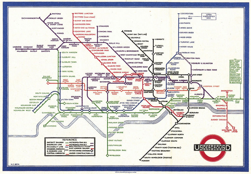
Well, big news: TfL has, it turned out, looked into this. “We did an exercise a couple of years ago,” Hunter told me. “There’s been a lot of criticism about how Harry Beck’s version” – the work of the draughtsman who originated the modern Tube Map, essentially inventing the modern science of metro maps in the process – “was better”.
But, Hunter added: “When you look at the number of lines and stations, we have a vastly more complex network now, and we do make it as simple as we possibly can.” It was relatively easy, in other words, for Harry Beck to simplify the network as it existed in the 1930s. But throw in two extra tube lines, a bunch of suburban extensions necessitating more space to the north and east, six different Overground lines, two light rail systems, the cable car, the Elizabeth line, Thameslink… The design of the modern Tube Map is messier, Hunter argues, because the network is messier – or, at least, more complicated.
Far be it from me to question the judgement of a man who knows far more about these things than I do, but: I am not entirely convinced by this. It isn’t just Harry Beck’s map that feels cleaner than the modern map, but numerous amateur versions, by the likes of Jug Cerovic, Wikipedia-user “Sameboat”, or Maxwell Roberts, the psychology lecturer behind Tube Map Central and the man whose circular tube map I wrote about the other week. The latter, as it happens, agrees that the modern Tube Map has lost its way. “The current state of the official London Underground map is lamentable for all sorts of reasons,” he argued in a recent post. “It fails by any criterion of effectiveness you can imagine and has been in a neglected state of decline for years.” So has there really been no thought of starting with a blank page and trying again from scratch?
“We do sometimes debate that,” Hunter admits. “But we need to be really careful not to damage one of our crown jewels.” The extant tube map relies on various graphical shortcuts – Hunter highlights the P-shape of the Hainult loop, or the way the Central line sweeps down to central London and up again – that users have come to rely on when orienting themselves. “There’s a risk that any meaningful change would render it very alien to most customers.”
The result is that, while TfL has mocked-up alternative designs, “the end result doesn’t make it less complicated: you still end up with a complex network, that’s just drawn in a different way. And then you’ve created a new barrier, because you’ve undone the mental tricks customers have built up over a decade, and they need to learn a new graphical approach.” More than that, one passenger’s unnecessary clutter – the icons showing different levels of wheelchair access, the sometimes over-complicated layout of intersections – is another’s vital accessibility data. “Generally what I find is [alternative maps], which make information cleaner and easier to understand, do so at the cost of removing accessibility information or fare information.” All of which means that, when it comes to creating an entirely new map, “the juice is not worth the squeeze”.
That said, Hunter does say the map is constantly under review. His team are looking at ways of cleaning up some of the more complicated interchange stations, like Moorgate/Liverpool Street or Paddington. And he responds surprisingly well to my rant about how the use of various shades of grey to show the fare zones is ruining the map for everyone. “That’s something we are looking at over the next period of time: we’re doing in-depth research with customers, asking whether people still use the fare map to plan their journey.”
Even more pleasingly, when I complain that the current map shows the two Bethnal Green stations the wrong way around – the Overground, which lies to the south, is currently shown above the Underground, a fact that particularly annoys me because they’re my local stations – Hunter replies, “I’ll make a note of that and look into it.” It could be a necessary trade off to avoid over-complicating the design, I admit, with my characteristic generosity; sure, Hunter replies, but it could also be that simply that nobody realised. Watch this space.
There is one other thing I want to ask Hunter about before I let him go: some of the decisions around showing the network’s newest railway. Why, I ask, is it always “Elizabeth line” on signage – and never just “Elizabeth”, in the way you will see “Piccadilly” or “Bakerloo”?
“Two reasons,” he says. One is that “it’s not just a line, but a mode in itself” – something comparable not merely to the Bakerloo, but to the entire Tube. I’m not convinced by this either, but this does seem to be the line from all parties, and I suppose if you spent £18bn on a railway line you’d probably want to treat it like it was a whole new network, too.
The other reason is “to give it the full respect that the name should have. It’s named after the previous monarch – calling it ‘line’ provides the context that this is a railway”. Before I can suggest this sounds just a bit forelock tug-y, Hunter makes the annoyingly reasonable point that Britain’s biggest railways are generally referred to as, say, “the East Coast Main Line”, not merely “the East Coast”. It still feels a little unnecessary: but over time, I imagine, as “Elizabeth” comes to feel no stranger as a line- or place name than “Victoria”, the “line” may be quietly dropped.
There’s just one more thing, I ask, imagining myself to have an ace up my sleeve like Columbo: given Hunter’s focus on brand consistency, why are the parallel lines of the Elizabeth Line still the dark blue of its predecessor, TfL Rail, on the Tube Map? Why are they not, as all the signage and branding suggests they should be, purple?
At which, he says something that genuinely surprises me: that it is purple after all. It’s only the density of other colours around it that means it can appear, to some of us1, blue. He compares the phenomenon to the viral photograph of the blue and black/white and gold dress that went viral back in 2015. “It’s the limitations of print, and how the brain processes a small amount of one colour compared to other colours. It means that sometimes it looks more blue than it does purple.”
This feels like obvious nonsense – I know what colour I’m looking at. But when I zoom in on the map and look at a stretch of the Elizabeth line without others to distract me, it turns out he’s entirely correct. It really has been purple this entire time.
It’s at least possible that the head of design at TfL does know more about the Tube Map than I do after all.
If you want to read more stuff like this/support the kind of nerd who writes it, then as ever paying subscribers get more things, much earlier!
If you can’t afford to pay then just hit reply and you can have a freebie (really, it’s not a trick; if you already did this and I didn’t reply it’s because I missed the email, just kick me again). But if you can, here’s a convenient button to help with that:
And if you enjoyed all that, you might also enjoy my book which also, as it happens, makes a brilliant Christmas present:
Also now available in North America!
On the original version of this post I included a footnote reading: it’s not just me, right? Based on the comments, I’ve since learned that it’s not just me, but it’s certainly not many of us.


